 |  |

| |
Creating Button Widgets
Standard Options for Each Button Type
Table of Options for Button-Type Widgets
Displaying Text on Buttons
Displaying an Image or Bitmap
Checkbutton and Radiobutton Indicator Status
On and Off Values for a Checkbutton
Radiobutton Values
The -command Option
Disabling a Button
Text Manipulation
Altering the Button's Style
Changing the Size of a Button
Adding a Keyboard Mapping
Color Options
Indicator Colors
Hiding the Indicator
Focus Options
Altering the Highlight Rectangle
Configuring a Button
Flashing the Button
Invoking the Button
Turning a Checkbutton/Radiobutton On and Off
Almost all Perl/Tk applications use Buttons in one way or another. There are three different types of Button widgets available in the standard Perl/Tk set: Button, Checkbutton, and Radiobutton. This chapter covers all three types of Buttons and includes examples of where you might use one over the other.
Each of the Buttons we cover in this chapter look different, primarily in their use of selection indicators. The Button widget doesn't use indicators at all, but Checkbutton and Radiobutton widgets use them to indicate whether the Button has been selected or not. The Button widgets are:
A Button is one of the simplest Perl/Tk widgets: the user presses it and something immediately happens. The label of the Button should make the action clear; for example, text such as Quit, Save, or Print gives the user a good idea of what will happen when she clicks the Button. After the Button has been clicked, it will look exactly the same as before, unless programmed to change text or color.
Checkbuttons are for when you want to select none, some, or all items. For example, a shopping list might consist of Bread, Milk, Soda, and Eggs. Select none if you don't need any of them, or select all if you're out of everything. As the user clicks on each Checkbutton, the selection indicator will be filled in or left blank as appropriate (see Figure 4-4).
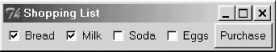
After a user presses the Purchase Button, the code examines the value of each Checkbutton's variable to decide what tasks to perform next.
Radiobuttons, on the other hand, all assign the same variable and are necessarily related. Radiobuttons are used in situations when you must make a choice between items, such as on a multiple-choice exam, as shown in Figure 4-5.
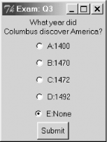
Because each Radiobutton in a group is associated with the same variable, you are forced to select one and only one choice in that group. If the default choice is always E and you click on D, E is unselected automatically.
As with any widgets you create, you call a method from the parent widget that matches the name of the widget:
$button = $mw->Button->pack;
$rb = $mw->Radiobutton->pack;
$cb = $mw->Checkbutton->pack;
These are unrealistic examples as you will most likely use some options when creating each different Button type:
# Create a Button widget
$mw->Button(-text => 'Go', -command => \&go_go_go)->pack;

# Create a Checkbutton
$cb = $mw->Checkbutton(-text => 'Red', -onvalue => 'Red',
	-offvalue => '')->pack;

# Create three Radiobuttons in Frame widget $f1
# Link them using $favcolor
foreach (qw/red blue green/) {
    $f1->Radiobutton(-text => $_, -variable => \$favcolor,
        -value => $_)->pack(-anchor => 'w');
}
We'll explain the options used in the previous examples in upcoming sections. In particular, -command expects a callback, which we'll mention briefly in Section 4.9, "The -command Option", but we won't fully describe until Chapter 15, "Anatomy of the MainLoop".
The only time you might not want to save a reference is when you create a Button, set the text, and set a simple callback for it all at once:
$mw->Button(-text => 'Quit', -command => sub { print 'Bye!'; exit; })->pack; |  | |
| 3.5. Font Manipulation Methods |  | 4.2. Standard Options for Each Button Type |

Copyright © 2002 O'Reilly & Associates. All rights reserved.