 |  |

| |
There are times you'll want users to type in specific information, such as their names, addresses, or even serial numbers. The simplest way to do this is to use Entry widgets. You can use a Label widget with an Entry to clearly communicate to the user what should be typed in the Entry. Most often, you'll see the Label and Entry combination used multiple times in a database Entry-type window where there are many different pieces of information the user must enter.
A Label is like a Button that doesn't do anything. It is a noninteractive widget and by default cannot have the keyboard focus (meaning you can't tab to it). It does nothing when you click on it (see Figure 5-1).
Excluding Frame-like widgets, the Label is the simplest widget. It is similar to a Button in that it can show text (or a bitmap), have relief (default is flat), display multiple lines of text, have a different font, and so on. Figure 5-2 shows a simple window, with both a Button and Label, created with this code:
use Tk;
$mw = MainWindow->new( );
$mw->Label(-text => "Label Widget")->pack( );
$mw->Button(-text => "Exit", -command => sub { exit })->pack( );
MainLoop;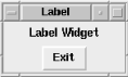
Here are some typical uses for a Label:
Put a Label to the left of an Entry widget so the user knows what type of data is expected.
Put a Label above a group of Radiobuttons to clarify its purpose (e.g., "Background Color:"). You can do the same with Checkbuttons if they happen to be related or along the same theme.
Use a Label to tell users what they did wrong: "The number entered must be between 10 and 100." (Typically, you would use a Dialog composite widget to give messages to the user like this, but not always.)
Put an informational line across the bottom of your window. Each of the other widgets would have a mapping that displays a string containing information about that widget.
Add an icon or decorative image to your application.
The command to create a Label is, of course, Label. Here's the basic usage:
$label = $parent->Label( [ option => value . . . ] )->pack( );
Hopefully you are starting to see a trend in the creation command. As you might expect, when you create a Label, you can specify options that will change its appearance and how it behaves.
The following is a comprehensive list of options for Labels:
This list briefly describes each option and what it does. Some of the options have different defaults for the Label widget than we are used to seeing with Button-type widgets, causing the Label to behave a bit differently.
When we created Button-type widgets, we could either click them with the mouse or tab to them and then use the keyboard to press the Button. A Label widget, on the other hand, does not interact with the user unless we add explicit bindings. It is there for informational purposes only, so there is no -command option.
The default value for the -takefocus option is 0, which means you cannot tab to it. When tabbing between widgets on the screen, the highlight rectangle shows us which widget currently has the keyboard focus. Since we don't allow the Label to have the focus (remember, -takefocus is set to 0), it doesn't make sense to have a visible highlight rectangle. The default value for the -highlightthickness option in a Label widget is 0. You can make a rectangle appear around a Label by setting -highlightthickness to something greater than 0, and setting -highlightbackground to a color, such as blue or red.
The Label widget also doesn't have a -state option. Since we shouldn't be able to click a Label, we should never have to disable it.
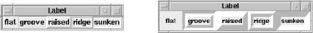
In Figure 5-3, you can see what happens when you change the Label's -relief option. Notice that the edges of the widget are very close to the text. Unlike a Button, you usually don't want much extra space around the Label (space is controlled by the -padx and -pady options). Normally you want the Label widget to sit right next to the widget (or widgets) it is describing.
Seeing what a widget looks like with different relief values sometimes helps determine where the widget ends, especially with a widget that has a default value of 'flat'. Also, changing the relief of different widgets ensures that we know which widgets are where on the screen. After creating 10 Entries and Labels with less-than-creative variable names, it's easy to lose track. Changing the border width is bound to make that one widget stand out. Color is also a good way to make a diagnostic message.
You can use the groove or ridge relief when making a help or status Label along the bottom of a window. Such a Label is packed with -side => 'bottom' and -fill => 'x'. There are two different ways you can use a status Label:
Set the variable associated with it so it changes as your program progresses, announcing to the user that it is busy or that something is happening.
Have the help Label give information on each of the different widgets in your application when it becomes active, using the bind command.
Both types are demonstrated in the following sample code.
This code shows the "What I'm doing now" type of help Label:
$mw->Label(-textvariable => \$message, -borderwidth => 2,
           -relief => 'groove')->pack(-fill => 'x',
                                      -side => 'bottom');
$mw->Text( )->pack(-side => 'top',
                            -expand => 1,
                            -fill => 'both');

$message = "Loading file index.html...";
...
$message = "Done";
The Label is created across the bottom of the screen. We pack it first because we want it to stay on the screen if we resize the window (remember, the last widgets packed get lower priority if the window runs out of room). As the program executes (represented by the ...), it changes the Label accordingly.
This code shows an example of using a widget-helper help Label:
$mw->title("Help Label Example");

$mw->Label(-textvariable => \$message)
   ->pack(-side => 'bottom', -fill => 'x');

$b = $mw->Button(-text => "Exit", -command => \&exit, -relief => 'groove')
        ->pack(-side => 'left');
&bind_message($b, "Press to quit the application");

$b2 = $mw->Button(-text => "Do Nothing")->pack(-side => 'left');
&bind_message($b2, "This Button does absolutely nothing!");

$b3 = $mw->Button(-text => "Something",
  -command => sub { print "something\n"; })->pack(-side => 'left');
&bind_message($b3, "Prints the text 'something'");

sub bind_message {
  my ($widget, $msg) = @_;
  $widget->bind('<Enter>', [ sub { $message = $_[1]; }, $msg ]);
  $widget->bind('<Leave>', sub { $message = ""; });
}
This example is a bit longer, because we are using the bind method (the bind method is explained in more detail in Chapter 15, "Anatomy of the MainLoop"). We want to associate a help message with each widget we create. We do this by adding bindings to each widget, which change the variable $message to a specified string when the mouse enters the widget and to an empty string if the mouse leaves the widget. We use a subroutine to avoid writing the same two bind lines over and over. Figure 5-4 shows what our window looks like with the mouse over the center Button.
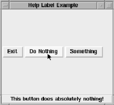
In Figure 5-4, you can see the example text is centered within the Label widget. When using a single line Label and filling the widget across the screen, the text remains centered, even if you add the-justify => 'left' option. You can get around this by creating a container Frame, giving it the desired relief, filling the Frame across the screen (instead of the Label), and placing the Label widget within the Frame:
$f = $mw->Frame(-relief => 'groove',
                -bd => 2)->pack(-side => 'bottom',
                                -fill => 'x');
$f->Label(-textvariable => \$message,)->pack(-side => 'left');
This allows the Label to grow and shrink within the Frame as necessary, while the text sticks to the left side. Even better, perhaps, is to simply use -anchor => 'w' when configuring the Label.
If you've typed in this short example and played with the strings bound to each widget, you might have noticed that the window will resize itself if the text assigned to $message is too long to display in the Label. This can get annoying if your window is fairly small to begin with. There are two ways to deal with this: first, you can always use really short text strings; second, you can tell the window not to resize when the Label changes size.
The drawbacks with each approach aren't too bad, and which one you pick just depends on the application you are working on. If you can write really short sentences that make sense, great. Telling the window not to resize is almost as easy, though; it is accomplished by adding one line to your program:
$mw->packPropagate(0);
Using packPropagate will cause your window not to resize when a widget is placed inside the window (we first talked about packPropagate in Chapter 2, "Geometry Management"). This means that your window might not show all your widgets right away. You can deal with this by keeping packPropagate on until you get all your widgets in, figuring out a good starting size for your window, and using $mw->geometry(size) to request that size initially. (See Chapter 11, "Frame, MainWindow,and Toplevel Widgets" for info on the geometry method.)
Label is a pretty boring widget, so there are only two methods available to change or get information on it: cget and configure. Both methods work for Label the same way they work for the Button widget. Please refer to Chapter 5, "Label and Entry Widgets" for details on arguments and return values.
|  | |
| 4.23. Turning a Checkbutton/Radiobutton On and Off |  | 5.2. The Entry Widget |
Copyright © 2002 O'Reilly & Associates. All rights reserved.