 | Cascading Style Sheets: The Definitive Guide |  |

General Concepts
Relative Positioning
Absolute Positioning
Fixed Positioning
Stacking Positioned Elements
Summary
The idea behind positioning is fairly simple. It allows you to define exactly where element boxes will appear relative to where they would ordinarily be -- or relative to a parent element, or another element, or even to the browser window itself. The power of this feature is both obvious and surprising. It shouldn't be too surprising to learn that this is the part of CSS2 that user agents usually first attempt to support. Given that there were some very good positioning implementations on the horizon as the book was being completed, we felt it worthwhile to give readers a glimpse of what's coming soon -- or, if you're reading this book a year or three after its publication, what can be done.
You may notice that, unlike other chapters, almost none of the figures in this chapter was generated with a web browser. This is something of a statement about the reliability and consistency of positioning implementations at the time of this writing: not one of them was solid enough to trust completely. It was actually easier to draw theoretical examples by hand than to take screenshots in web browsers and then retouch them in Photoshop.
This is also why this chapter is largely (but not entirely) free of browser warnings and caveats. Rather than drown the explanatory text in side notes, we have chosen to simply describe positioning as it is given by the CSS2 specification and leave things there. Perhaps the second edition of this book will contain more practical advice, but at this time, the only practical advice we can give is this: test your positioning code thoroughly, and be prepared for inconsistencies between positioning implementations.
Before delving into the specific mechanisms of positioning, we need to establish a number of concepts. These concepts actually form the foundation of CSS layout in general since every displayed element can be described in terms of its positioning. After all, any element that is placed onscreen, or printed on a piece of paper, has a position and must therefore be positioned -- by the user agent, if nothing else.
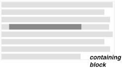
The containing block is the context in which formatting takes place. For example, the containing block of a boldface element could be the paragraph in which it occurs, as demonstrated in Figure 9-1.
Not every element in CSS generates a containing block for its descendant elements. The rules for the establishment of a containing block are as follows:
The containing block of the "root element" (also called the initial containing block) is established by the user agent. In HTML, the root element is the HTML element, although some browsers may incorrectly use BODY.
For nonroot elements that are not absolutely positioned, the containing block for an element is set as the content edge of the nearest block-level ancestor. This is true even in relative positioning, although it might not seem so at first.
For nonroot elements that are absolutely positioned using a position of absolute, the containing block is set to the nearest ancestor (of any kind) that has a position other than static. This happens as follows:
If the ancestor is block-level, the containing block is set to be that element's padding edge; in other words, the area that would be bounded by a border.
If the ancestor is inline-level, the containing block is set to the content edge of the ancestor. In left-to-right languages, the top and left of the containing block are the top and left content edges of the first box in the ancestor, and the bottom and right edges are the bottom and right content edges of the last box. In right-to-left languages, the right edge of the containing block corresponds to the right content edge of the first box, and the left is taken from the last box. The top and bottom are the same.
If there is no such ancestor, then the content edge of the root element is used to establish a containing block.
The main thing to remember about the containing block is that it establishes a formatting context for all of its descendant elements. For example, if margins are declared as percentages, the percentages are calculated with respect to the containing block. This gives us rule #2, which says that the containing block is usually equivalent to the content area of an element.
Another important thing about the containing block is this: elements can be positioned outside of their containing block. This is very similar to the way in which floated elements can use negative margins to float outside of their parent's content area. It also makes it seem like the term "containing block" should really be "positioning context," but since the specification uses "containing block," so will this text. (We do try to minimize confusion. Really!)
You can choose one of four different types of positioning by using the position property.
position
- Values
static | relative | absolute | fixed | inherit
- Initial Value
static
- Applies to
all elements
- Inherited
no
The values of position have the following meanings:
The element's box is generated as normal. Block-level elements generate a rectangular box that is part of the document's flow, and inline-level boxes are generated in the context of one or more line boxes that are flowed within their parent element.
The element's box is offset by some distance. Its containing block is the area that the element would occupy if it were not positioned. The element retains the shape it would have had were it not positioned, and the space that the element would ordinarily have occupied is preserved. Relative positioning is accomplished by generating the element as though it were set to static, and then simply shifting the element's box (or boxes, in the case of an inline element that crosses multiple lines). It is possible that the positioned element will overlap other content. The direction and magnitude of the offset are specified using some combination of the properties top, right, bottom, and left.
The element's box is completely removed from the flow of the document and positioned with respect to its containing block. Whatever space the element might have occupied in the normal document flow is closed up, as though the element did not exist. The size and position of the element are defined by a combination of the properties height, width, top, right, bottom, and left, plus any margins, padding, and borders set for the element. Absolutely positioned elements can have margins, but these margins do not collapse.
The element's box is positioned as though it were set to absolute, but its containing block is the viewport itself. In screen media such as web browsers, the element will not move within the browser window when the document is scrolled. This allows for frame-style layouts, for example. In paged media such as printouts, a fixed element will appear in the same place on every page. This potentially can be used to create running heads or footers.
The value is inherited from the parent element. See Chapter 10, "CSS2: A Look Ahead", for more details.
Three of the positioning schemes described in the previous section -- relative, absolute, and fixed -- use four distinct properties to describe the offset of a positioned element's sides with respect to its containing block. These four properties, which we will refer to as the side-offset properties, are a big part of what makes positioning work.
These properties describe an offset from the nearest side of the containing block (thus the term side-offset ). For example, top describes how far the outer top edge of the positioned element should be placed from the top of its containing block. In the case of top, positive values move the top edge of the positioned element downward, while negative values move it above the top of its containing block. Similarly, left describes how far to the right (for positive values) or left (for negative values) the outer left edge of the positioned element is from the left edge of its containing block. Another way to look at it is that positive values cause inward offsets, moving the edges toward the center of the containing block, and negative values cause outward offsets.
TIP
The description of offsetting the outer edges is based on an erratum. The original CSS2 specification actually says that the content edges are offset, but it has been widely agreed that this is a serious error, and in fact, readings of other parts of the specification show that it is the outer edges that are offset.
The implication of offsetting the outer edges of a positioned element is that everything about an element -- margins, borders, padding, and content -- is moved in the process of positioning the element. In other words, it is possible to set margins, borders, and padding for a positioned element. These will be preserved and kept with the positioned element, and will be contained within the area defined by the side-offset properties.
There are two other side-offset property values that should be mentioned here. The first, static-position, causes the user agent to place the given side of a positioned element where it would have been if the element had not been positioned. For example, consider a nonpositioned element whose top edge is 3 ems from the top of its containing block. If the element is then positioned and given a top of static-position, then the top of the positioned element will be 3 ems from the top of the containing block. Later in the chapter, we'll see how this can be useful.
The other value, auto, allows for some even more interesting effects. It acts much the same as setting auto on margins, but in positioning, this can permit the creation of elements that are only as wide or tall as they need to be in order to display their content, without having to exactly specify how high or wide that will be. We'll explore this in detail later in the chapter as well.
It is important to remember that the side-offset properties define offset from the analogous side (e.g., left defines the offset from the left side) of the containing block, not from the upper-left corner of the containing block. That's why, for example, one way to fill up the lower-right corner of a containing block would use these values:
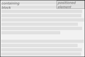
top: 50%; bottom: 0; left: 50%; right: 0;
In this example, the outer left edge of the positioned element is placed halfway across the containing block. This is its offset from the left edge of the containing block. The outer right edge of the positioned element, however, is not offset from the right edge of the containing block, so the two are coincident. Similar reasoning holds true for the top and bottom of the positioned element: the outer top edge is placed halfway down the containing block, but the outer bottom edge is not moved up from the bottom. This leads to what's shown in Figure 9-2.
TIP
What's depicted in Figure 9-2, and in most of the examples in this chapter, will only work if the containing block was established by an element with an explicitly defined height. This is because a line in the specification says that if the height of the containing block is not explicitly specified -- say, for example, that it's dependent on the content of the element, as in a normal paragraph -- then both top and bottom for any positioned element within that containing block are treated as auto.
In addition, even though they don't explicitly say so, the examples in this section (and the next few sections) are all based around absolute positioning. Since absolute positioning is the simplest scheme in which to demonstrate how top, right, bottom, and left work, we'll stick to that for now.
Note that the positioned element has padding, a double border, and a slightly different background color. In Figure 9-2, it has no margins, but if it did, they would create blank space between the borders and the offset edges. This would make the positioned element appear as though it did not completely fill the lower-right quarter of the containing block. In truth, it would do so, but this would not be immediately apparent to the eye. In other words, the following two sets of styles would have the same visual appearance, assuming the containing block to be 100 ems high by 100 ems wide:
top: 50%; bottom: 0; left: 50%; right: 0; margin: 10em;
top: 60%; bottom: 10%; left: 60%; right: 10%; margin: 0;
Again, the similarity would be only visual in nature.
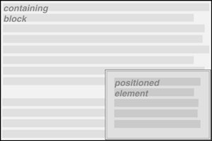
By using negative values, it is possible to position an element outside its containing block. For example, the following values will lead to the result shown in Figure 9-3:
top: -5em; bottom: 50%; left: 75%; right: -3em;
Now let's see why leaving out width and height isn't always a bad thing in positioning, as well as how declaring them can work to your advantage.
There will be many cases when, having determined where you're going to position an element, you will want to go ahead and declare how wide and how high that element should be. In addition, there will likely be conditions where you'll want to limit how high or wide a positioned element gets, not to mention cases where you want the browser to go ahead and automatically calculate the width, or the height, or both.
If you want to give your positioned element a specific width, then the obvious property to turn to is width. Similarly, height will let you declare a specific height for a positioned element.
width
- Values
<length> | <percentage> | auto
- Initial Value
auto
- Applies to
block-level and replaced elements
- Inherited
no
WARNING
Percentage values refer to the width of the containing block.
height
- Values
<length> | auto
- Initial Value
auto
- Applies to
block-level and replaced elements
- Inherited
no
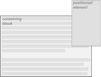
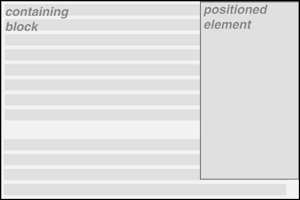
Although it is sometimes important to set the width and height of an element, this is not always necessary when positioning elements. For example, if the placement of the four sides of the element is described using top, right, bottom, and left, then the height and width of the element are determined by the placement of the sides. Assume that you want an element to fill the left half of its containing block, from top to bottom. You could use these styles, with the result depicted in Figure 9-4:
top: 0; bottom: 0; left: 0; right: 50%;
Since the default value of both width and height is auto, the result shown in Figure 9-4 is exactly the same as if you had used these styles:
top: 0; bottom: 0; left: 0; right: 50%; width: auto; height: auto;
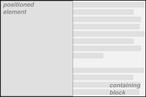
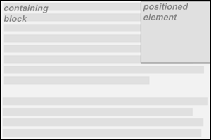
Now let's say you want to position an element that is in the upper-right corner of its containing block and is one-third as wide as its containing block, but only as tall as necessary to display its content, as shown in Figure 9-5.
This is where auto really comes into its own. The styles needed to get the result shown in Figure 9-5 is:
top: 0; bottom: auto; left: auto; right: 0; width: 33%; height: auto;
Because top is set to 0, and bottom and height are set to auto, the user agent is free to size the element so that it's just tall enough to display its own content, and no taller. This happens thanks to the revised rules for calculating the height and width of absolutely positioned elements, which were published in an errata to the original specification.
Note that the fact that we set an explicit width helped matters. Since the user agent knew how wide the element should be, it was a trivial matter to calculate the height of the element based on its content. If width has also been set to auto, then the user agent would have had to assign some value to it. This value is likely to vary by user agent, so it's usually better to declare a width that you like.
Of course, this is not always the case: you could set an explicit height and let the width scale to fit the content. Thus:
top: 0; bottom: auto; left: auto; right: 0; width: auto; height: 10em;
Here the element will be 10 ems tall no matter what, but its width can vary to exactly fit the content. This is sometimes called "shrink-wrapping" the content, since it mimics the act of applying shrink-wrap to a box or other product. In the same way the plastic shrink-wrap precisely hugs the contents of the package, so too does a positioned element -- given the right styles, of course.
If bottom is set to an actual value -- percentage or length -- then the height of the positioned element is constrained. As a demonstration, let's set bottom to be a specific value, with the result shown in Figure 9-6:
top: 0; bottom: 10%; left: auto; right: 0; width: 33%; height: auto;
In this case, the height of the element must be 90% the height of the containing block, since 100% - - 10% = 90%. This assumes, of course, that there have been no margins, borders, or padding set for the positioned element; otherwise, the effective height would be decreased, although the entire element (content, padding, borders, and margins) would still be 90% as tall as the containing block.
Similarly, if we specifically declare a height but leave bottom as auto, then something like Figure 9-7 will occur:
top: 0; bottom: auto; left: auto; right: 0; width: 33%; height: 45%;
In this case, the placement of the bottom of the positioned element is the same as if we'd declared bottom: 55%, because 100% - - 45% = 55%.
Many of the same principles hold true for widths, of course. For example:
top: 100px; bottom: 200px; left: 30%; right: 10%; height: auto; width: auto;
Here, the width of the element is effectively 60% the width of its containing block.
As wonderful as all of this is, there arises a serious question. Suppose you have a positioned element that you don't want to be any smaller than a certain size? Consider the following styles:
top: 10%; bottom: 20%; left: 50%; right: 10%;
Thus the height is 70%, and the width 40% of the containing block's height and width. That's fine as far as it goes -- but what happens if the containing block is only 50 pixels tall by 200 pixels wide? That gives you an element only 35 pixels wide by 80 pixels tall. That doesn't leave much room to show the content, but if you use auto for the width or height, the element might fill its entire containing block, obscuring the containing block's contents.
As we'll see later in the chapter, you have the option to force your content to overflow the element. For now, however, let's concentrate on ways to deal with its width and height. You could try explicitly assigning a width and height, like this:
top: 10%; bottom: 20%; left: 50%; right: 10%; width: 30em; height: 15em;
However, this approach seems a little heavy-handed, and could have disastrous consequences in small browsing environments like handheld devices. Furthermore, it forces you to declare a specific height and width, which gives up a lot of flexibility. Wouldn't it be better to define certain limits for the size of the height and width?
Should it become necessary or desirable, you can place limits on an element's width and height by using the following CSS2 properties, which I'll refer to as the min-max properties.
min-width
- Values
<length> | <percentage> | inherit
- Initial Value
UA specific
- Applies to
all elements except nonreplaced inline elements and table elements
- Inherited
no
WARNING
max-width
- Values
<length> | <percentage> | none | inherit
- Initial Value
UA specific
- Applies to
all elements except nonreplaced inline elements and table elements
- Inherited
no
WARNING
min-height
- Values
<length> | <percentage> | inherit
- Initial Value
0
- Applies to
all elements except nonreplaced inline elements and table elements
- Inherited
no
WARNING
max-height
- Values
<length> | <percentage> | none | inherit
- Initial Value
none
- Applies to
all elements except nonreplaced inline elements and table elements
- Inherited
no
WARNING
The names of these properties make them fairly self-explanatory. Here we have one possible solution for the example given in the previous section:
top: 10%; bottom: 20%; left: 50%; right: 10%;
  min-width: 20em; min-height: 30em;
Of course, this still isn't a very good solution, since it forces the element to be at least 20em wide by 30em tall. Here's a better one:
top: 10%; bottom: auto; left: 50%; right: 10%; height: auto; min-width: 15em;
Here we have a case where the element should be 40% as wide as the containing block but can never be less than 15em wide. We've also changed the bottom and height so that they're automatically determined. This will let the element be as tall as necessary to display its content, no matter how narrow it gets (never less than 15em, of course!).
We can turn this around to keep elements from getting too wide or tall by using max-width and max-height. Let's consider a situation where, for some strange reason, we want an element to have three-quarters the width of its containing block, but to stop getting wider when it hits 400 pixels. The appropriate styles are:
left: 0%; right: auto; width: 75%; max-width: 400px;
The great advantage of the min-max properties is that they let you mix units with relative safety. You can set percentage-based sizes while setting length-based limits, or vice versa.
TIP
These min-max properties can be very useful in conjunction with floated elements as well. For example, you can allow a floated element's width to be relative to the width of its parent element (which is its containing block), while also making sure that the float's width never goes below 10em. The reverse approach is also possible:
P.aside {float: left; width: 40em; max-width: 40%;}This will set the float to be 40em wide, unless that would be more than 40% the width of the containing block, in which case the float will be narrowed.
Of course, it's still possible to use these properties to keep an element from exceeding a certain size, as in this:
max-height: 30em; max-width: 20em;
The question here, though, is what happens if the content of the element doesn't all fit into the specified element size. Does it get cut off at the boundaries, or does it spill outside the positioned element? That's what the next section will explore.
Should the content of an element be too much for the element's size, it will be in danger of overflowing the element itself. There are a few alternatives in such situations, and CSS lets you select between them. It will also allow you to define a clipping region to determine the area of the element outside which these sorts of things become an issue, as well as give a way to clip off parts of an element.
So let's say that you have, for whatever reason, an element that has been pinned to a specific size, and the content doesn't fit. You can take control of the situation with the overflow property.
overflow
- Values
visible | hidden | scroll | auto | inherit
- Initial Value
visible
- Applies to
block-level and replaced elements
- Inherited
no
This property only applies in one (or more) the following cases:
When an element has negative margins.
When a line box must be wider than its parent's content area, perhaps due to the existence of an unusually long word, nonwrapped text such as PRE text, or another circumstance where line-wrapping cannot occur.
When a block-level box is wider than its parent's content area.
When an element's box is taller than the height explicitly set for its parent.
When an element has been absolutely positioned.
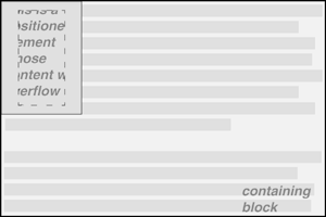
The default value of visible means that the content may be visible outside the element's box. Typically, this would lead to the content simply running outside its own element box, but not altering the shape of that box. The following styles would result in Figure 9-8:
DIV#sidebar {position: absolute; top: 0; left: 0; width: 25%; height: 7em;
  overflow: visible;}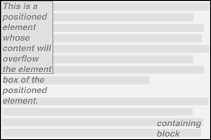
TIP
The specification does not say whether or not visible overflowed content can overlap the content of other elements, but it is reasonable to infer that this is possible. Since positioned elements can overlap other elements, it stands to reason that the content of a positioned element should be treated no differently.
If the overflow is set to scroll, the element's content is clipped -- that is, cannot be seen -- but some way is provided to make the extra content available to the user. In a web browser, this would mean a scrollbar (or set of them) or another method of accessing the content without altering the shape of the element itself. One possibility is depicted in Figure 9-9, which could result from the following styles:
DIV#sidebar {position: absolute; top: 0; left: 0; width: 15%; height: 7em;
  overflow: scroll;}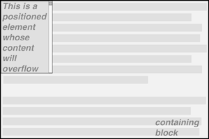
If scroll is used, the panning mechanisms (e.g., scrollbars) should always be rendered. To quote the specification, "this avoids any problems with scrollbars appearing or disappearing in a dynamic environment." Thus, even if the element has sufficient space to display all of its content, the scrollbars would still appear. In addition, when printing a page or otherwise displaying the document in a paged medium, the content should be displayed as though the value of overflow were declared to be visible.
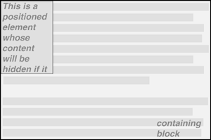
If the overflow is set to hidden, the element's content is clipped, but no mechanism should be provided to make the content accessible to the user. Consider the following styles:
DIV#sidebar {position: absolute; top: 0; left: 0; width: 15%; height: 7em;
  overflow: hidden;}
In such an instance, the clipped content would not be accessible to the user. This would lead to a situation like that illustrated by Figure 9-10.
Finally, there is overflow: auto. This allows user agents to determine what behavior to use, although they are encouraged to provide a scrolling mechanism when necessary. This is a potentially useful way to use overflow, since user agents could interpret it to mean "provide scrollbars only when needed." (They may not, but they certainly could, and probably should.)
In the simplest case, the clipping region for any positioned element is the content area of the element itself, as depicted in Figure 9-10. However, you may wish to change the clipping area. That's what we'll do in the next section.
In situations where the content of an element overflows its element box, and overflow has been set such that the content should in fact be clipped, it is possible to alter the shape of the clipping region by using the property overflow-clip.
overflow-clip
- Values
rect(<top>, <right>, <bottom>, <left>) | auto | inherit
- Initial Value
auto
- Applies to
block-level and replaced elements with an overflow value other than visible
- Inherited
no
The default value, auto, means that the clipping region should have the same size and location as the element's content area. The other possibility is to define a clipping shape that is relative to the element's content area. This does not alter the shape of the content area, but instead alters the area in which content may be rendered.
TIP
While the only clipping shape available in CSS2 is a rectangle, the specification does offer the possibility that other shapes will be included in future specifications.
This is done with the shape value rect(top, right, bottom, left). We could specify no change in the clipping region like this:
overflow-clip: rect(0, auto, auto, 0);
This would be no different than declaring overflow-clip: auto. It's more interesting to shift the clipping area, of course. For example:
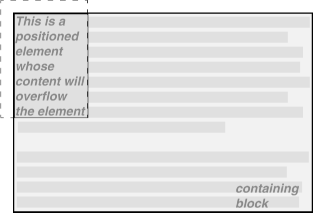
DIV#sidebar {position: absolute; top: 0; left: 0; width: 5em; height: 7em;
  overflow: hidden; overflow-clip: rect(0.5em, 4em, 6.5em, 1em);}
This sets the clipping area inward half an em from the top and bottom, and one em from the right and left. This would cause a result something like that shown in Figure 9-11, where a dashed line has been added to illustrate the edges of the clipping region. This line would not actually appear in a user agent attempting to render the document.
The syntax of rect is an interesting case. Technically, it can be rect(top, right, bottom, left) -- note the commas -- but the CSS2 specification contains examples both with and without commas and defines rect as accepting both the comma and noncomma versions. This text will stick to the comma version mostly because it makes things easier to read.
It is extremely important to note that the values for rect(...) are not side-offsets. They are, instead, distances from the upper-left corner of the element. Thus, a clipping rectangle which encloses a square 20 pixels by 20 pixels in the upper-left corner of the element would be defined as:
rect(0, 20px, 20px, 0)
The only values permitted with rect(...) are length values and auto, which is the same as "set the clipping edge to the appropriate content edge." Thus, the following two statements mean the same thing:
overflow-clip: rect(auto, auto, 10px, 1cm);
overflow-clip: rect(0, 0, 10px, 1cm);
It is possible to set negative lengths, though, which will expand the clipping area outside the element's box. If you wanted to push the clipping area up and left by a quarter-inch, it would be done with the following styles (illustrated by Figure 9-12):
overflow-clip: rect(-0.25in, auto, auto, -0.25in);
This doesn't do much good, as you can see. The clipping rectangle extends up and to the left, but since there isn't any content there, the visual effect is the same as if the author had declared overflow-clip: auto.
On the other hand, it might be okay to go beyond the bottom and right edges, but not the top or left. Figure 9-13 shows the results of these styles (and remember, the dashed lines are only for illustrative purposes):
DIV#sidebar {position: absolute; top: 0; left: 0; width: 5em; height: 7em;
overflow: hidden; overflow-clip: rect(0, 6em, 9em, 0);}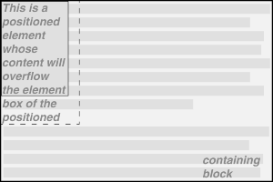
This extends the area in which content can be seen. However, it doesn't change the flow of the content, so the only visual effect is that more content can be seen below the element. The text does not flow out to the right, because the width of its line boxes is still constrained by the width of the positioned element. If there had been an image wider than the positioned element, or preformatted text with a long line, this might have been visible to the right of the positioned element, up to the point where the clipping rectangle ends.
The syntax of rect(...) is, as you may have already realized, rather unfortunate. It is based on an early draft of the positioning section, which used the top-left-offset scheme. Internet Explorer implemented this before CSS2 was made a full Recommendation, and so came into conflict with a last-minute change that made rect(...) use side-offsets, just like the rest of CSS2. This was done, reasonably enough, because it would make positioning consistent with itself.
By then, however, it was too late: there was an implementation in the marketplace, and rather than force Microsoft to change the browser and thus potentially cause existing pages to break, the standard was changed to reflect implementation. This means, sadly, that it is impossible to set a consistent clipping rectangle in situations where the height and width are not precisely defined. For example, there is no way to create a clipping rectangle that is 1 em larger than this element's content area:
position: absolute; top: 0; bottom: 50%; right: 50%; left: 0;
Since there is no way to know how many ems tall or wide the element will be, there is no way to make a clipping rectangle that ends 1 em to the right, or 1 em below, the content area of the element.
Further compounding the problem is that rect(...) only accepts length units and auto. The addition of percentage units as valid rect(...) values would go a long way toward improving things, and hopefully a future version of CSS will add this capability.
There is another way to clip in CSS, but this is very different from what we've just seen.
clip
- Values
rect(<top>, <right>, <bottom>, <left>) | auto | inherit
- Initial Value
auto
- Applies to
block-level and replaced elements
- Inherited
no
This property can be used to clip the element with a simple intersection operation. The area of the element contained within the clip rectangle is displayed, and any part of it outside that rectangle is not. In addition, the clip rectangle is set in relation to the outer edge of the element -- not its content edge. Thus, let's say you wanted (for whatever reason) to clip the top 10 pixels of an image:
<IMG SRC="foo.gif" STYLE="clip: rect(10px, auto, auto, 0);">
The auto values will set the clipping rectangle's bottom to align with the bottom of the image, and the right edge to the right edge of the image. The value of 0 for left keeps the left edge of the clipping rectangle against the left edge of the image, but the 10px for top moves the top edge of the clipping rectangle downward 10 pixels. This will cause the top 10 pixels of the image to become effectively invisible.
clip can be applied to any element. Thus, you could display only the top left corner of a paragraph using something like this:
<P STYLE="clip: rect(0, 10em, 10em, 0);">
This will display a square 10 ems wide by 10 ems high. This square is drawn from the top left outer corner, so any margins, borders, and padding will influence how much of the element is visible and how much is clipped out.
In addition to all the clipping and overflowing, you can also control the visibility of an entire element.
visibility
- Values
visible | hidden | collapse | inherit
- Initial Value
inherit
- Applies to
all elements
- Inherited
no
This one is pretty easy. If an element is set to have visibility: visible, then it is visible. Of course.
However, if an element is set to visibility: hidden, it is made "invisible" (to use the wording in the specification). In its invisible state, the element still affects the document's layout as though it were visible. In other words, the element is still there: you just can't see it. Note the difference between this and display: none. In the latter case, the element is not displayed and is removed from the document altogether so that it doesn't have any effect on document layout. Figure 9-14 shows a document in which an EM element has been set to be hidden, based on the following styles and markup:
EM.trans {visibility: hidden; border: 3px solid gray; background: silver;
  padding: 1em;}

<P>
This is a paragraph which should be visible. Lorem ipsum, dolor sit amet,
<EM CLASS="trans">consectetuer adipiscing elit, sed diam nonummy nibh </EM>
euismod tincidunt ut laoreet dolore magna aliquam erat volutpat.
</P>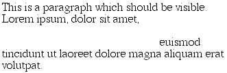
Everything visible about an element -- such as content, background, and borders -- will be made invisible. Note that the space is still there because the element is still part of the document's layout. We just can't see it.
Note too that it's possible to set the descendant element of a hidden element to be visible. This would cause the element to appear wherever it normally would, despite the fact that the ancestor (and possibly the siblings) is invisible. In order to do so, you would need to explicitly declare the descendant element to be visible, since visibility is inherited. Thus:
P.clear {visibility: hidden;}
P.clear EM {visibility: visible;}
As for visbility: collapse, this value is used in CSS table rendering, which isn't covered in this book because it wasn't well implemented as the book was being written. According to the CSS2 specification, collapse has the same meaning as hidden if it is used on nontable elements. From a semantic standpoint, this seems somewhat confusing (since collapse sounds like it should trigger the kind of behavior you'd see with display: none), but there it is nonetheless.
|  | |
| 8.5. Summary |  | 9.2. Relative Positioning |

Copyright © 2002 O'Reilly & Associates. All rights reserved.