 | HTML & XHTML: The Definitive Guide, 4th Edition |  |

Checkboxes and radio buttons give you powerful means for creating multiple-choice questions and answers, but they can lead to long forms that are tedious to write and put a fair amount of clutter onscreen. The <select> tag gives you two compact alternatives: pull-down menus and scrolling lists.
By placing a list of <option>-tagged items inside the <select> tag of a form, you magically create a pull-down menu of choices.
<select>
- Function:
Create single- and multiple-choice menus
- Attributes:
CLASS
ONKEYPRESS
DIR
ONKEYUP
DISABLED
ONMOUSEDOWN
ID
ONMOUSEMOVE
LANG
ONMOUSEOUT
MULTIPLE
ONMOUSEOVER
NAME
ONMOUSEUP
ONBLUR
SIZE
ONCHANGE
STYLE
ONCLICK
TABINDEX
ONDBLCLICK
TITLE
ONFOCUS
ONKEYDOWN
- End tag:
</select>; never omitted
- Contains:
select_content
- Used in:
form_content
As with other form tags, the name attribute is required and used by the browser when submitting the <select> choices to the server. Unlike radio buttons, no item is preselected, so if none is selected, no values are sent to the server when the form is submitted. Otherwise, the browser submits the selected item or collects multiple selections, separated with commas, into a single parameter list and includes the name attribute when submitting <select> form data to the server.
To allow more than one option selection at a time, add the multiple attribute to the <select> tag. This causes the <select> element to behave like an <input type=checkbox> element. If multiple is not specified, exactly one option can be selected at a time, just like a group of radio buttons.
The size attribute determines how many options are visible to the user at one time. The value of size should be a positive integer. The default value is 1 when size isn't specified. At size=1, if multiple is not specified, the browser typically displays the <select> list as a pop-up menu. Size values greater than one or specification of the multiple attribute cause the <select> to be displayed as a scrolling list.
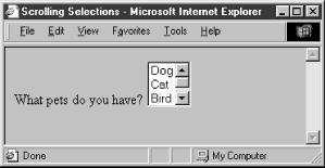
In the following XHTML example, we've converted our previous checkbox example into a scrolling, multiple-choice menu. Notice also that the size attribute tells the browser to display three options at a time:[60]
[60]Notice the </option> end tags. They are not usually included in standard HTML documents, but must appear in XHTML.
What pets do you have?
  <select name="pets" size="3" multiple="multiple">
    <option>Dog</option>
    <option>Cat</option>
    <option>Bird</option>
    <option>Fish</option>
  </select>
The result is shown in Figure 9-6.
Use the <option> tag to define each item within a <select> form control.
<option>
- Function:
Define available options within a <select> menu
- Attributes:
CLASS
ONMOUSEDOWN
DIR
ONMOUSEMOVE
DISABLED
ONMOUSEOUT
ID
ONMOUSEOVER
LABEL
ONMOUSEUP
LANG
SELECTED
ONCLICK
STYLE
ONDBLCLICK
TITLE
ONKEYDOWN
VALUE
ONKEYPRESS
ONKEYUP
- End tag:
</option>; usually omitted in HTML
- Contains:
plain_text
- Used in:
select_content
The browser displays the <option> tag's contents as an element within the <select> tag's menu or scrolling list, so the content must be plain text only, without any other sort of markup.
Use the value attribute to set a value for each option the browser sends to the server if that option is selected by the user. If the value attribute has not been specified, the value of the option is set to the content of the <option> tag. As an example, consider these HTML options:
<option value=Dog>Dog
<option>Dog
Both have the same value. The first is explicitly set within the <option> tag; the second defaults to the content of the <option> tag itself.
By default, all options within a multiple-choice <select> tag are unselected. Include the selected attribute (no value) inside the <option> tag to preselect one or more options, which the user may then deselect. Single-choice <select> tags will preselect the first option if no option is explicitly preselected.
Menus of choices in forms can be quite large, making them difficult to display and use. In these cases, it is helpful to group related choices, which can then be presented as a set of nested, cascading menus to the user. New in HTML 4.0, the <optgroup> tag brings this capability to HTML and XHTML forms, albeit limited.
Use the <optgroup> tag only within a <select> tag, and it may only contain <option> tags. The browser creates submenus for each <optgroup> tag within the main <select> menu. For example, with HTML you might use <optgroup> to present a form menu of states organized by region:
<select name=state>
   <optgroup label=Northeast>
      <option>Maine
      <option>New Hampshire
      ...
   </optgroup>
   <optgroup label=South>
      <option>Georgia
      <option>Florida
      ...
   </optgroup>
   ...
</select>
Since no browser yet fully supports the <optgroup> tag (the popular browsers simply display them as a scrolling menu), we can't show you what this menu might look like. However, it will probably look and feel much like the familiar pull-down menus that are a common feature of most graphical user interfaces. When selected with the mouse or keyboard, the optgroup opens into one or more menus. For instance, our "state" example probably will have submenus labeled "Northeast," "South," and so on, each of which can be pulled open to reveal a list of included states.
Regrettably, the biggest drawback to the <optgroup> tag is that it cannot be nested, limiting you to one level of submenus. Presumably this restriction will be lifted in a future version of XHTML.
<optgroup>
- Function:
Group related <option> elements within a <select> menu
- Attributes:
CLASS
ONKEYUP
DIR
ONMOUSEDOWN
DISABLED
ONMOUSEMOVE
ID
ONMOUSEOUT
LABEL
ONMOUSEOVER
LANG
ONMOUSEUP
ONCLICK
STYLE
ONDBLCLICK
TITLE
ONKEYDOWN
ONKEYPRESS
- End tag:
</optgroup>; may be omitted in HTML
- Contains:
optgroup_contents
- Used in:
select_content
|  | |
| 9.7. Multiline Text Areas |  | 9.9. General Form Control Attributes |

Copyright © 2002 O'Reilly & Associates. All rights reserved.