 | HTML & XHTML: The Definitive Guide, 4th Edition |  |

Properly done, a form can provide an effective user interface for your readers. With some server-side programming tricks, you can use forms to personalize the documents that you present to readers and thereby significantly increase the value of your pages on the Web.
Unlike other graphical user interfaces, browser displays are static. They have little or no capability for real-time data validation, for example, or to update the values in a form based upon user input, giving users no help or guidance.[61] Hence, poorly designed web forms can be difficult to fill out.
[61]This is not entirely true. While neither HTML nor XHTML provide for data validation and user guidance, it is possible to attach Java or JavaScript applets to your form elements that do a very nice job of validating form data, updating form fields based upon user input, and guiding users through your forms.
Make sure your forms assist users as much as possible in getting their input correct. Adjust the size of text input fields to give clues on acceptable input: five-character (or the new nine-character) zip code fields, for instance. Use checkboxes, radio buttons, and selection lists whenever possible to narrow the list of choices the user must make.
Make sure you also adequately document your forms. Explain how to fill them out, supplying examples for each field. Provide appropriate hyperlinks to documentation that describes each field, if necessary.
When the form is submitted, make sure that the server-side application exhaustively validates the user's data. If an error is discovered, present the user with intelligent error messages and possible corrections. One of the most frustrating aspects of filling out forms is having to start over from scratch whenever the server discovers an error. To alleviate this ugly redundancy and burden on your readers, consider spending extra time and resources on the server side that returns the user's completed form with the erroneous fields flagged for changes.
While these suggestions require significant effort on your part, they will pay off many times over by making life easier for your users. Remember, you'll create the form just once, but it may be used thousands or even millions of times by users.
Although most PCs have been upgraded to provide resolution significantly better than the 600 x 480 that was common when we wrote the first edition of this book, many devices (laptops with poor screens, WebTV, cell phones with built-in browsers) dictate that form design should be conservative. The best compromise is to assume a document-viewing window roughly 75 readable characters wide and 30 to 50 lines tall. You should design your forms (and all your documents) so that they are effective when viewed through a window of this size.
You should structure your form to scroll naturally into two or three logical sections. The user can fill out the first section, page down; fill out the second section, page down; and so forth.
You should also avoid wide input elements. It is difficult enough to deal with a scrolling-text field or text area without having to scroll the document itself horizontally to see additional portions of the input element.
When you elect to create a form, you immediately assume another role: that of a user-interface designer. While a complete discussion of user interface design is beyond the scope of this book, it helps to understand a few basic design rules to create effective, attractive forms.
Any user interface is perceived at several levels simultaneously. Forms are no different. At the lowest level, your brain recognizes shapes within the document, attempting to categorize the elements of the form. At a higher level, you are reading the text guides and prompts, trying to determine what input is required of you. At the highest level, you are seeking to accomplish a goal with the interface as your tool.
A good form accommodates all three of these perceptive needs. Input elements should be organized in logical groups so that your brain can process the form layout in chunks of related fields. Consistent, well-written prompts and supporting text assist and lead the user to enter the correct information. Text prompts also remind users of the task at hand and reinforce the form's goal.
Users process forms in a predictable order, one element after another, seeking to find the next element as they finish the previous one. To accommodate this searching process, you should design your forms so that one field leads naturally to another, and related fields are grouped together. Similarly, groups should lead naturally to one another and should be formatted in a consistent manner.
Simply stringing a number of fields together does not constitute an effective form. You must put yourself in the place of your users, who are using the form for the first time. Test your form on unsuspecting friends and colleagues before you release it on the general public. Is it easy to determine the purpose of the form? Where do you start filling things out? Can the user find a button to push to submit the form? Is there an opportunity to confirm decisions? Do readers understand what is expected of them for each field?
Your forms should lead the user naturally through the process of supplying the necessary data for the application. You wouldn't ask for a street address before asking for the user's name; other rules may dictate the ordering of other groups of input elements. To see if your form really works, make sure you view it on several browsers and have several people fill it out and comment on its effectiveness.
At first glance, the basic rule of HTML and XHTML -- content, not style -- seems in direct opposition to the basic rule of good interface design -- precise, consistent layout. Even so, it is possible to use some elements to greatly improve the layout and readability of most forms.
Traditional page layout uses a grid of columns to align common elements within a page. The resulting implied vertical and horizontal "edges" of adjacent elements give a sense of order and organization to the page and make it easy for the eye to scan and follow.
HTML and XHTML make it hard, but you can accomplish the same sort of layout for your forms. For example, you can group related elements and separate groups with empty paragraphs or horizontal rules.
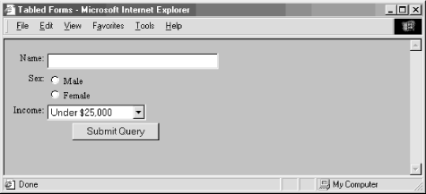
Vertical alignment is more difficult, but not impossible. In general, forms are easier to use if you arrange the input elements vertically and aligned to a common margin. One popular form layout keeps the left edge of the input elements aligned, with the element labels immediately to the left of the elements. This is done by using tables to place and align each form element and its label. Here is our previous HTML form example, with the labels placed in the first column and the corresponding elements in the second:
<form method=POST action="http://www.kumquat.com/demo">
  <table border=0>
    <tr valign=top>
      <td align=right>Name:</td>
      <td align=left><input type=text name=name size=32 maxlength=80>
      </td>
    </tr>
    <tr valign=top >
      <td align=right>Sex:</td>
      <td align=left>
        <input type=radio name=sex value="M"> Male <br>
        <input type=radio name=sex value="F"> Female
      </td>
    </tr>
    <tr valign=top >
      <td align=right>Income:</td>
      <td align=left>
        <select name=income size=1>
          <option>Under $25,000
          <option>$25,001 to $50,000
          <option>$50,001 and higher
        </select>
      </td>
    </tr>
    <tr valign=top>
      <td colspan=2 align=center>
        <input type=submit value="Submit Query">
      </td>
    </tr>
  </table>
</form>
Notice in the resulting rendered form shown in Figure 9-9 that the table has placed each input element in its own row. The align attributes in the table cells force the labels to the right and the elements to the left, creating a vertical margin through the form. By spanning the cell in the last row, the submission button is centered with respect to the entire form. In general, using tables in this manner makes form layout much easier and consistent throughout your documents. If you find this example at all difficult, see Chapter 10, "Tables", Tables, which explains all the glories of tables in detail.
You may find other consistent ways to lay out your forms. The key is to find a useful layout style that works well across most browsers and stick with it. Even though HTML and XHTML have limited tools to control layout and positioning, take advantage of what is available in order to make your forms more attractive and easier to use.
|  | |
| 9.10. Labeling and Grouping Form Elements |  | 9.12. Forms Programming |

Copyright © 2002 O'Reilly & Associates. All rights reserved.