 | Web Design in a Nutshell, 2nd Edition |  |

Ever look at a table and wonder, "How'd they do that?" This section provides templates that give you shortcuts for creating standard table effects.
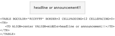
Figure 13-21 depicts a simple one-cell table containing text. By setting the background to a bright color, it can be used as an effective attention-getting device for a special announcement. It could also be used as an alternative to a graphical headline for a page. By using the align attribute in the <table> tag, you can position the table along the left or right margin and allow text to wrap around it, making a nice space for a sidebar or callout.
You can use width and height attributes to make the bar any size. Try playing with the border and cell padding for different effects. Remember, placing the bgcolor within the cell will render differently than placing it in the <table> tag in Internet Explorer, so experiment and test to see what you like the best. Note that because height is a nonstandard attribute, it may not work in all browsers (including Version 6 browsers operating in "strict" rendering mode).
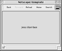
The table in the following code can be used to center an object in a browser window regardless of how the window is resized (as shown in Figure 13-22). It uses a single cell table with its size set to 100%, then centers the object horizontally and vertically in the cell.
<HTML>
<BODY>
<TABLE WIDTH=100% HEIGHT=100% BORDER=0 CELLSPACING=0 CELLPADDING=0>
<TR>
   <TD align=center valign=middle>your object here</TD>
</TR>
</TABLE>
</BODY>
</HTML>
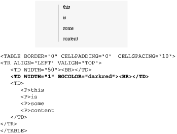
This sample table creates a vertical rule between columns that resizes with the height of the table. The trick is to create an extra column only one pixel wide (or the desired thickness of the vertical rule) and fill it with a background color. This cell is indicated in bold. The result is shown in Figure 13-23.
The cell cannot be totally empty or it will collapse in Navigator and its background color won't display, so I've added a <br>. For this to display correctly, the cell padding must remain at zero, or the 1-pixel wide column will plump up with extra space. Add space between columns with the cellspacing attribute instead.
Although Microsoft Internet Explorer recognizes the proprietary bordercolor, bordercolorlight, and bordercolordark attributes, there is no method for specifying border colors using standard HTML for all browsers.
To create a colored rule around a box of text using standard HTML, place one table within another as shown in Figure 13-24. To nest tables, place the entire contents of one table within a <td> of the other.
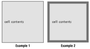
In Example 1 in Figure 13-24, cell width and height are set in the interior table. In the exterior table, a cell padding of 0 results in a one-pixel rule around the table. You can increase the thickness of the rule by increasing the cellpadding value. Note, however, that this will also increase the overall dimensions of the table. The color of the rule is specified by the bgcolor attribute in the <table> tag for the exterior table:
<TABLE CELLPADDING=0 BORDER=0>
<TR>
   <TD BGCOLOR="#333333" ALIGN=center VALIGN=center>
      <TABLE BORDER=0 WIDTH=200 HEIGHT=200 CELLPADDING=10>
      <TR><TD BGCOLOR="#999999">cell contents</TD></TR>
      </TABLE>
   </TD>
</TR>
</TABLE>
In Example 2 in Figure 13-24, to restrict the dimensions of the table, set specific dimensions for the exterior table and set the dimensions of the interior table slightly smaller (to a difference twice the desired rule thickness). In this example, the desired rule thickness is 10, so the interior table's dimensions are 20 pixels less than the exterior table's dimensions.
<TABLE WIDTH=200 HEIGHT=200 cellpadding=0 border=0>
<TR>
   <TD BGCOLOR="#333333" ALIGN=center VALIGN=center>
      <TABLE BORDER=0 WIDTH=180 HEIGHT=180 CELLPADDING=10>
      <TR><TD BGCOLOR="#999999">cell contents</TD></TR>
      </TABLE>
   </TD>
</TR>
</TABLE>Many sites use a two-column table to lay out the structure of their pages. This grid creates a narrow column on the left for navigational options and a wider column on the right for the page's contents, as shown in Figure 13-25. These sample tables can be used to provide a basic structure to the page; you can place any elements (including other tables) within either table cell to create more complex layouts.
When using a table to lay out the structure of a page, bear in mind that it will be placed in the page against the normal browser margins, not flush against the top and left edge of the browser window. The width of the margin varies from browser to browser (and platform to platform), but it generally ranges from 8 to 12 pixels. You should take this blank space into account when choosing measurements for your table and its column widths.
Getting rid of the browser margins for both Netscape Navigator and Microsoft Internet Explorer requires using redundant margin attributes in the <body> tag as shown here:
<BODY MARGINWIDTH=0 MARGINHEIGHT=0 LEFTMARGIN=0 TOPMARGIN=0>
If you are using style sheets, add the following rule:
BODY { margin:0; padding:0;}If it's predictability and control you're after, fixing the width of your table and its columns is the way to go. As long as the contents fit in the cells entirely, the table will hold its dimensions regardless of browser window size. If contents (such as graphics) are wider than the cell, the cell will usually expand to accommodate them.
Of course, you can change the specific width values to any pixel value you choose, but it is important that the total of the cell widths equals the width set for the entire table. If the values are different, browsers maintain the width setting for the table and resize all the columns proportionately within the allotted space. As a result, none of the column widths will display at the number of pixels you specified.
Note that the border in each of the following examples has been set to 1, but you can change it to any other value. Starting with the border set to 1 (as shown in Figure 13-25) makes it easier to see how the table is behaving. Once you get the table working properly, get rid of the border by setting the value to 0.
<HTML>
<BODY>
<TABLE BORDER=1 WIDTH=600>
<TR>
   <TD VALIGN=top WIDTH=150>left column</TD>
   <TD VALIGN=top WIDTH=450>right column</TD>
</TR>
</TABLE>
</BODY>
</HTML>
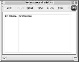
Using relative values for the width of your table allows your page to resize itself to fill the width of the browser window. Many designers prefer this method because it is more flexible and suits any monitor configuration. Although the actual column widths will change when the browser window resizes (and their contents will rewrap), they will remain in proportion to one another.
Again, you can turn the border off by setting the value to zero. You may change the width values for the cell in each column, but be sure that they total 100%.
<HTML>
<BODY>
<TABLE BORDER=1 WIDTH=100%>
<TR>
   <TD VALIGN=top WIDTH=20%>left column</TD>
   <TD VALIGN=top WIDTH=80%>right column</TD>
</TR>
</TABLE>
</BODY>
</HTML>
At times, you may want to restrict the width of the left column but allow the right column to resize with the page -- if you want the contents of the left column to stay aligned over a colored background image, for instance. Set the width of the left column to any pixel value you choose and do not specify a width for the right column.
This technique is not guaranteed to keep the width of the "fixed" column at its specified width. If the browser window is resized to be very narrow, the fixed column will be resized smaller and its contents will wrap.
<HTML>
<BODY>
<TABLE BORDER=1 WIDTH=100%>
<TR>
   <TD VALIGN=top WIDTH=150>left column</TD>
   <TD VALIGN=top>right column</TD>
</TR>
</TABLE>
</BODY>
</HTML>
The trick for maintaining a minimum width for a column is to place a graphic element in a cell that is sized to the desired column width. Some developers use a 1-pixel square graphic that is stretched using the width attribute.
|  | |
| 13.6. Tips and Tricks |  | 13.8. Multipart Images in Tables |

Copyright © 2002 O'Reilly & Associates. All rights reserved.