 | HTML & XHTML: The Definitive Guide, 4th Edition |  |

Use the <input> tag to define any one of a number of common form "controls," as they are called in the HTML 4 and XHTML standards, including text fields, multiple-choice lists, clickable images, and submission buttons. Although there are many attributes for the <input> tag, only the type and name attributes are required for each element (only type for a submission or reset button; see following explanation). And as we describe in detail later, each type of input control uses only a subset of the allowed attributes. Additional <input> attributes may be required based upon which type of form element you specify.
Table 9-1 summarizes the various form <input> types and attributes, required and optional.
|
Form Tag or <input> Type |
Attributes[58] |
|||||||||||||||||||||||||
|---|---|---|---|---|---|---|---|---|---|---|---|---|---|---|---|---|---|---|---|---|---|---|---|---|---|---|
|
accept |
accesskey |
align |
alt |
border |
cols |
checked |
disabled |
maxlength |
multiple |
name |
notab |
onBlur |
onChange |
onClick |
onFocus |
onSelect |
readonly |
rows |
size |
src |
tabindex |
taborder |
usemap |
value |
wrap |
|
|
button |
|
|
x |
|
|
|
|
|
|
x |
||||||||||||||||
|
checkbox |
|
|
|
x |
|
|
|
|
|
x |
||||||||||||||||
|
file |
|
|
|
|
x |
|
|
|
|
|
|
|
|
|
|
|||||||||||
|
hidden |
x |
x |
||||||||||||||||||||||||
|
image |
|
|
|
|
|
|
|
|
x |
|
|
|
||||||||||||||
|
password |
|
|
|
x |
|
|
|
|
|
|
|
|
|
|
x |
|||||||||||
|
radio |
|
|
|
x |
|
|
|
|
|
x |
||||||||||||||||
|
reset |
|
|
|
|
|
|
|
|||||||||||||||||||
|
submit |
|
|
|
|
|
|
|
|
||||||||||||||||||
|
text |
|
|
|
x |
|
|
|
|
|
|
|
|
|
|
|
|||||||||||
|
<button> |
|
|
x |
|
|
|
|
|
||||||||||||||||||
|
<select> |
|
|
x |
|
|
|
|
|
|
|||||||||||||||||
|
<textarea> |
|
|
|
x |
|
|
|
|
|
|
|
|
[58]( x = required;
= optional; blank = not supported)
<input>
- Function:
Create an input element within a form
- Attributes:
ACCEPT
ONFOCUS
ACCESSKEY
ONKEYDOWN
ALIGN
ONKEYPRESS
ALT
ONKEYUP
BORDER

ONMOUSEDOWN
CHECKED
ONMOUSEMOVE
CLASS
ONMOUSEOUT
DIR
ONMOUSEUP
DISABLED
ONSELECT
ID
READONLY
LANG
SIZE
MAXLENGTH
SRC
NAME
STYLE
NOTAB
TABINDEX
ONMOUSEOVER
TABORDER
ONBLUR
TITLE
ONCHANGE
TYPE
ONCLICK
USEMAP
ONDBLCLICK
VALUE
- End tag:
None in HTML; </input> or <input ... /> with XHTML
- Contains:
Nothing
- Used in:
form_content
You select the type of control to include in the form with the <input> tag's required type attribute, and you name the field (used during the form submission process to the server; see earlier description) with the name attribute. Although the value of the name attribute is technically an arbitrary string, we recommend that you use a name without embedded spaces or punctuation. If you stick to just letters and numbers (but no leading digits) and represent spaces with the underscore ( _ ) character, you'll have fewer problems. For example, "cost_in_dollars" and "overhead_percentage" are good choices for element names; "$cost" and "overhead %" might cause problems.
In addition, notice that the name you give to a form control is directly associated with the data that the u ser inputs to that control and which gets passed to the form-processing server. It is not the same as and does not share the same namespace with the name attribute for a hyperlink fragment or a frame document.
The HTML and XHTML standards let you include four types of text entry controls in your forms: a conventional text entry field, a masked field for secure data entry, a field that names a file to be transmitted as part of your form data, and a special multiline text entry <textarea> tag. The first three types are <input>-based controls; the fourth is a separate tag that we describe in Section 9.7, "Multiline Text Areas".
The most useful as well as the most common form input control is the text entry field. A text entry field appears in the browser window as an empty box on one line and accepts a single line of user input that becomes the value of the control when the user submits the form to the server. To create a text entry field inside a form in your document, set the type of the <input> form element to text. Include a name attribute as well; it's required.
What constitutes a line of text differs among the various browsers. Fortunately, HTML and XHTML give us a way, with size and maxlength attributes, to dictate the width, in characters, of the text input display box, and how many total characters to accept from the user, respectively. The value for either attribute is an integer equal to the maximum number of characters you'll allow the user to see and type in the field. If maxlength exceeds size, then text scrolls back and forth within the text entry box. If maxlength is smaller than size, there will be extra blank space in the text entry box to make up the difference between the two attributes.
The default value for size is dependent upon the browser; the default value for maxlength is unlimited. We recommend that you set them yourself. Adjust the size attribute so that the text entry box does not extend beyond the right margin of a typical browser window (about 60 characters with a very short prompt). Set maxlength to a reasonable number of characters; for example, 2 for state abbreviations, 12 for phone numbers, and so on.
A text entry field is usually blank until the user types something into it. You may, however, specify an initial default value for the field with the value attribute. The user may modify the default, of course. If the user presses a form's reset button, the value of the field is reset to this default value. Section 9.5.4.2, "Reset buttons"
These are all valid text entry form controls:
<input type=text name=comments>
<input type=text name=zipcode size=10 maxlength=10>
<input type="text" name="address" size="30" maxlength="256" />
<input type="text" name="rate" size="3" maxlength="3" value="100" />
The first example is HTML and creates a text entry field set to the browser's default width and maximum length. As we argued, this is not a good idea, because defaults vary widely among browsers, and your form layout is sure to look bad with some of them. Rather, fix the width and maximum number of acceptable input characters as we do in the second example: it lets the user type in up to ten characters inside an input box ten characters wide. Its value will be sent to the server with the name "zipcode" when the user submits the form.
The third example is XHTML and tells the browser to display a text input box 30 characters wide into which the user may type up to 256 characters. The browser automatically scrolls text inside the input box to expose the extra characters.
The last text input control is XHTML, too, three characters wide so that the user can type in only three characters, and sets its initial value to 100.
Notice in the second and fourth examples, it is implied that certain kinds of data are to be entered by the user -- a postal code or a numeric rate, respectively. Except for limiting how many, neither HTML nor XHTML provide a way for you to dictate what characters may be typed into a text input field. For instance, in the last example field, the user may type "ABC" even though you intend it to be a number less than 1,000. Your server-side application or an applet must trap erroneous or mistaken input, as well as check for incomplete forms, and send the appropriate error message to the user when things aren't right. That can be a tedious process, so we emphasize again: provide clear and precise instructions and prompts. Make sure your forms tell users what kinds of input you expect from them, thereby reducing the number of mistakes they may make when filling it out.
Like the Lone Ranger, the mask is on the good guys in a masked text field. It behaves just like a conventional text control in a form, except that the user-typed characters don't appear onscreen. Rather, the browser obscures the characters in a masked text to keep such things as passwords and other sensitive codes away from prying eyes.
To create a masked text control, set the value of the type attribute to password. All other attributes and semantics of the conventional text control apply to the masked one. Hence, you must provide a name, and you may specify a size and maxlength for the field, as well as an initial value (we recommend it).
Don't be misled: a masked text control is not all that secure. The typed-in value is only obscured onscreen; the browser transmits it unencrypted when the form is submitted to the server, unless you are using a special secure-forms server. So, while prying eyes may not see them onscreen, devious bad guys may steal the information electronically.
As its name implies, the file-selection control lets users select a file stored on their computer and send it to the server when they submit the form. The browser presents the file-selection form control to the user like other text fields, and accompanied by a button labeled "Browse" to its right. Users either type the pathname of the file directly as text into the field or, with the Browse option, select the name of a locally stored file from a system-specific dialog box.
Create a file-selection control in a form by setting the value of the type attribute to file. Like other text controls, the size and maxlength of a file-selection field should be set to appropriate values, with the browser creating a field 20 characters wide, if not otherwise directed. Since file and directory names differ widely among systems, it makes no sense to provide a default value for this control. As such, the value attribute should not be used with this kind of text control.
The Browse button opens a platform-specific file-selection dialog box that allows users to select a value for the field. In this case, the entire pathname of the selected file is placed into the field, even if the length of that pathname exceeds the control's specified maxlength.
Use the accept attribute to constrain the types of files that the browser lets the user select. Its value is a comma-separated list of MIME encodings; users can select only files whose type matches one of those in the list. For example, to restrict the selection to images, you might add accept="image/*" to the file selection <input> tag.
Unlike other form input controls, the file-selection field works correctly only with a specific form data encoding and transmission method. If you include one or more file-selection fields in your form, you must set the enctype attribute of the <form> tag to multipart/form-data and the <form> tag's method attribute to post. Otherwise, the file-selection field behaves like a regular text field, transmitting its value (that is, the file's pathname) to the server instead of the contents of the file itself.
This is all easier than it may sound. For example, here is an HTML form that collects a person's name and favorite file:
<form enctype="multipart/form-data" method=post
    action="cgi-bin/save_file">
Your name: <input type=text size=20 name=the_name>
<p>
Your favorite file: <input type=file size=20 name=fav_file>
</form>
The data transmitted from the browser to the server for this example form has two parts. The first contains the value for the name field, and the second contains the name and contents of the specified file:
-----------------------------6099238414674
Content-Disposition: form-data; name="the_name"

One line of text field contents
-----------------------------6099238414674
Content-Disposition: form-data; name="fav_file"; filename="abc"

First line of file
...
Last line of file
-----------------------------6099238414674--
The browsers don't check that a valid file has been specified by the user. If no file is specified, the filename portion of the Content-Disposition header will be empty. If the file doesn't exist, its name appears in the filename subheader, but there will be no Content-Type header or subsequent lines of file content. Valid files may contain nonprintable or binary data; there is no way to restrict user-selectable file types. In light of these potential problems, the form-processing application on the server should be robust enough to handle missing files, erroneous files, extremely large files, and files with unusual or unexpected formats.
The checkbox form control gives users a way to select or deselect an item quickly and easily in your form. Checkboxes may also be grouped to create a set of choices, any of which may be selected or deselected by the user.
Create individual checkboxes by setting the type attribute for each <input> tag to checkbox. Include the required name and value attributes. If the item is selected by the user, it will contribute a value when the form is submitted. If it is not selected, that element will not contribute a value. The optional checked attribute (no value) tells the browser to display a checked checkbox and include the value when submitting the form to the server unless the user specifically clicks the mouse to deselect (uncheck) the box.
The popular browsers include the value of selected (checked) checkboxes with other form parameters when they are submitted to the server. The value of the checked checkbox is the text string you specify in the required value attribute. For example, in XHTML:
<form>
  What pets do you own?
  <p>
    <input type="checkbox" name="pets" value="dog" /> Dog
  <br />
    <input type="checkbox" checked="checked" name="pets" value="cat" /> Cat
  <br />
    <input type="checkbox" name="pets" value="bird" /> Bird
  <br />
    <input type="checkbox" name="pets" value="fish" /> Fish
  </p>
</form>
creates a checkbox group as shown in Figure 9-3.
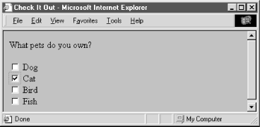
Although part of the group, each checkbox control appears as a separate choice onscreen. Notice too, with all due respect to dog, bird, and fish lovers, that we've preselected the cat checkbox with the checked attribute in its tag. We've also provided text labels; the similar value attributes don't appear in the browser's window, but are the values included in the form's parameter list if the checkbox is selected and the form is submitted to the server by the user. Also, you need to use paragraph or line-break tags to control the layout of your checkbox group, as you do for other form controls.
In the example, if "Cat" and "Fish" are checked when the form is submitted, the values included in the parameter list sent to the server would be:
pets=cat
pets=fish
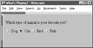
Radio-button form controls are similar in behavior to checkboxes, except that only one in the group may be selected by the user.[59] Create a radio button by setting the type attribute of the <input> tag to radio. Like with checkbox controls, radio buttons each require a name and value attribute. Radio buttons with the same name are members of a group. One of them may be initially checked by including the checked attribute with that element. If no element in the group is checked, the browser automatically checks the first element in the group.
[59]Some of us are old enough, while not yet senile, to recall when automobile radios had mechanical pushbuttons for selecting a station. Pushing in one button popped out the previously depressed one, implementing a mechanical one-of-many choice mechanism.
You should give each radio button element a different value, so that the form-processing server can sort them out after submission of the form.
Here's the previous example reworked in HTML so you get to choose only one animal as a favorite pet (see Figure 9-4):
<form>
  Which type of animal is your favorite pet?
  <p>
    <input type=radio name=favorite value="dog"> Dog
    <input type=radio checked name=favorite value="cat"> Cat
    <input type=radio name=favorite value="bird"> Bird
    <input type=radio name=favorite value="fish"> Fish
</form>
Like the previous example with checkboxes, we've tipped our hat toward felines, making the "Cat" radio button the default choice. If you select an alternative -- "Bird," for instance -- the browser automatically deselects "Cat." When the user submits the form to the server, the browser includes only one value with the name "favorite" in the list of form parameters; favorite=bird, if that was your choice.
One of the controls in a group of radio buttons is always selected, so it makes no sense to create a single radio button; they should appear in your documents as groups of two or more. (Use checkboxes for on/off, yes/no types of form controls.)
Although the terminology is potentially confusing, there is another class of buttons for forms. Unlike the radio buttons and checkboxes described previously, these special types of form controls act immediately, their effects cannot be reversed, and they affect the entire contents of the form, not just the value of a single field. These "action" buttons (for lack of a better term) include submit, reset, regular, and clickable image buttons. When selected by the user, both the submit and image buttons cause the browser to submit all of the form's parameters to the form-processing server. A regular button does not submit the form, but can be used to invoke an applet to manipulate or validate the form. The reset button acts locally to return a partially filled-out form to its original (default) state. Section 12.3.3, "JavaScript Event Handlers"
In this section we describe the action buttons that you may create with the standard form <input> element. In the next section, we describe in detail the newer <button> tag that achieves identical effects and allows you greater control over the presentation and display of your form buttons.
The submit button (<input type=submit>) does what its name implies, setting in motion the form's submission to the server from the browser. You may have more than one submit button in a form. You may also include name and value attributes with the submit type of input form button.
With the simplest submit button (that without a name or value attribute), the browser displays a small rectangle or oval with the default label "Submit." Otherwise, the browser labels the button with the text you include with the tag's value attribute. If you provide a name attribute, the value attribute for the submit button is added to the parameter list the browser sends along to the server. That's good, because it gives you a way to identify which button in a form was pressed, letting you process any one of several different forms with a single form processing application.
The following are all valid submission buttons:
<input type=submit>
<input type=submit value="Order Kumquats">
<input type="submit" value="Ship Overnight" name="ship_style" />
The first one is in HTML and is also the simplest: the browser displays a button, labeled "Submit," which activates the form-processing sequence when clicked by the user. It does not add an element to the parameter list that the browser passes to the form processing server and application.
The second example HTML button has the value attribute that makes the displayed button label "Order Kumquats," but like the first example does not include the button's value in the form's parameter list.
The last example, in XHTML, sets the button label and makes it part of the form's parameter list. When clicked by the user, the last example of the submission button adds the parameter ship_style="Ship Overnight" to the form's parameter list.
The reset type of form <input> button is nearly self-explanatory: it lets the user reset -- erase or set to some default value -- all elements in the form. Unlike the other buttons, a reset button does not initiate form processing. Instead, the browser does the work of resetting the form elements. The server never knows (or cares, for that matter) if or when the user might have pressed a reset button.
By default, the browser displays a reset button with the label "Reset." You can change that by specifying a value attribute with your own button label.
Here are two sample reset buttons:
<input type=reset>
<input type="reset" value="Use Defaults" />
The first one creates a reset button labeled "Reset"; the browser labels the second example reset button with "Use Defaults." They both initiate the same reset response in the browser.
The image type of <input> form element creates a custom button that is a "clickable" image. It's a special button made out of your specified image that, when clicked by the user, tells the browser to submit the form to the server and includes the x,y coordinates of the mouse pointer in the form's parameter list, much like the mouse-sensitive image maps we discuss in Chapter 6, "Links and Webs". Image buttons require a src attribute with the URL of the image file, and you can include a name attribute and a descriptive alt attribute for non-graphical browsers. Although deprecated in HTML 4, you may also use align to control alignment of the image within the current line of text. Use the border attribute to control the width, if any, of the frame Netscape puts around the form image much like the border attribute for the <img> tag (Internet Explorer doesn't place a border around form <input> images).
Here are a couple of valid image buttons:
<input type="image" src="pics/map.gif" name="map" />
<input type=image src="pics/xmap.gif" align=top name=map>
The browser displays the designated image within the form's content flow. The second button's image will be aligned with the top of the adjacent text, as specified by the align attribute. Netscape Navigator adds a border, as it does when an image is part of an anchor (<a> tag), to signal that the image is a form button.
When the user clicks the image, the browser sends the horizontal offset, in pixels, of the mouse from the left edge of the image and the vertical offset from the top edge of the image to the server. These values are assigned the name of the image as specified with the name attribute, followed by .x and .y, respectively. Thus, if someone clicked the image specified earlier in the example, the browser would send parameters named map.x and map.y to the server.
Image buttons behave much like mouse-sensitive image maps (usemaps), and, like the programs or client-side <map> tags that process image maps, your form-processor may use the x,y mouse-pointer parameters to choose a special course of action. You should use an image button when you need additional form information to process the user's request. If an image map of links is all you need, use a mouse-sensitive image map. Mouse-sensitive images also have the added benefit of providing server-side support for automatic detection of shape selection within the image, letting you deal with the image as a selectable collection of shapes. Buttons with images require you to write code that determines where the user clicked on the image and how this position can be translated to an appropriate action by the server.
Oddly, the HTML 4 and XHTML standards allow the use of the usemap attribute with an image button, but do not explain how such a use might conflict with normal server processing of the x,y coordinates of the mouse position. We recommend not mixing the two, using mouse-sensitive images outside of forms and image buttons within forms.
Using the <input type=button> tag (or the <button> tag, described in Section 9.6, "The <button> Tag"), you can create a button that can be clicked by the user but that does not submit or reset the form. The value attribute can be used to set the label on the button; the name attribute, if specified, will cause the supplied value to be passed to the form processing script.
You might wonder what value such buttons provide: little or none, unless you supply one or more of the event attributes along with a snippet of JavaScript to be executed when the user interacts with the button. Thus empowered, regular buttons can be used to validate form contents, update fields, manipulate the document, and initiate all sorts of client-side activity.Section 12.3.3, "JavaScript Event Handlers"
You can have several buttons of the same or different types in a single form. Even simple forms have both reset and submit buttons, for example. To distinguish between them, make sure each has a different value attribute, which the browser uses for the button label. Depending on the way you program the form-processing application, you might make the name of each button different, but it is usually easier to name all similarly acting buttons the same and let the button handling subroutine sort them out by value. For instance (all in HTML):
<input type=submit name=action value="Add">
<input type=submit name=action value="Delete">
<input type=submit name=action value="Change">
<input type=submit name=action value="Cancel">
When the user selects one of these example buttons, a form parameter named action will be sent to the server. The value of this parameter will be one of the button names. The server-side application gets the value and behaves accordingly.
Since an image button doesn't have a value attribute, the only way to distinguish between several image buttons on a single form is to ensure that they all have different names.
The last type of form input control we describe in this chapter is hidden from view. No, we're not trying to conceal anything. It's a way to embed information into your forms that cannot be ignored or altered by the browser or user. Rather, the <input type=hidden> tag's required name and value attributes automatically get included in the submitted form's parameter list. These serve to label the form and can be invaluable when sorting out different forms or form versions from a collection of submitted and saved forms.
Another use for hidden fields is to manage user/server interactions. For instance, it helps the server to know that the current form has come from a person who made a similar request a few moments ago. Normally, the server does not retain this information and each transaction between the server and client is completely independent from all other transactions.
For example, the first form submitted by the user might have asked for some basic information, such as the user's name and where they live. Based on that initial contact, the server might create a second form asking more specific questions of the user. Since it is tedious for users to re-enter the same basic information from the first form, the server can be programmed to put those values in the second form in hidden fields. When the second form comes back, all the important information from both forms is there, and the second form can be matched to the first one, if necessary.
Hidden fields may also direct the server towards some specific action. For example, you might embed the hidden field:
<input type=hidden name=action value=change>
Therefore, if you have one server-side application that handles the processing of several forms, each form might contain a different action code to help that server application sort things out.
|  | |
| 9.4. Using Email to Collect Form Data |  | 9.6. The <button> Tag |

Copyright © 2002 O'Reilly & Associates. All rights reserved.
