 | HTML & XHTML: The Definitive Guide, 4th Edition |  |

As we described earlier, you create an action button with traditional HTML or XHTML by including its type value in the standard <input> tag. For instance, the <input type=submit> form control creates a button that, when selected by the user, tells the browser to send the form's contents to the processing server or to an email address (mailto option). Display-wise, you don't have any direct control over what that submit button looks like, beyond changing the default label "Submit" to some other word or short phrase like "Hit me" or "Outta here!"
First introduced in the HTML 4.0 standard, the <button> tag acts the same as the <input> button, but gives you more control over how the element gets displayed by the browser. In particular, all of the attributes you might use with the <input type=button> element are acceptable with the <button> tag.
<button>
- Function:
Create a button element within a form
- Attributes:
ACCESSKEY
ONKEYDOWN
CLASS
ONKEYPRESS
DIR
ONKEYUP
DISABLED
ONMOUSEDOWN
ID
ONMOUSEMOVE
LANG
ONMOUSEOUT
NAME
ONMOUSEUP
NOTAB
STYLE
ONMOUSEOVER
TABINDEX
ONBLUR
TABORDER
ONCLICK
TITLE
ONDBLCLICK
TYPE
ONFOCUS
VALUE
- End tag:
</button>; never omitted
- Contains:
button_content
- Used in:
form_content
Neither the HTML 4 nor the XHTML standard is overly clear as to what display enhancements to a form button control the <button> element should provide, other than to suggest that the contents should be 3D and visually appear to react like a push button when selected by the user; that is, go in and back out when pressed. Internet Explorer Version 5 and Netscape Version 6 support <button>.
The <button> control does provide for a greater variety and richer contents over its <input> analogues. Everything between the <button> and </button> tags becomes the content of the button, including any acceptable body content, such as text or multimedia. For instance, you could include an image and related text within a button, creating attractive labelled icons in your buttons. The only verboten element is an image map, since its mouse- and keyboard-sensitive actions interfere with the form button.
Use the type attribute for the <button> tag to define the button's action. Its value should be set to submit, reset, or button. Like its <input> analog, a <button type=submit>, when selected by the user, tells the browser to package and send the contents of the form to the form-processing server or email it to the mailto recipient. Using type=reset creates a conventional reset button, and using type=button creates a conventional push button.
For example, Figure 9-5 shows how Netscape Navigator renders the following exclaim.gif icon inset on a 3D button that pushes in and pops back out when the user clicks it with the mouse. In doing so, the browser submits the form to the server:
<button type=submit>
Order <img src="icons/exclaim.gif" align=middle alt="Order Now"> Now!
</button>
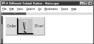
Notice that you can exploit the rich set of <img> tag attributes, including align and alt, for this <button> style of form control.
Since the <button> tag is so similar to the <input type=button> element, why have it at all? The only reason is to provide far richer content for buttons. If your buttons are conventional text buttons, the <input> tag will suffice. If you want to create fancy mixed-content buttons, you'll need to use the <button> tag.
|  | |
| 9.5. The <input> Tag |  | 9.7. Multiline Text Areas |

Copyright © 2002 O'Reilly & Associates. All rights reserved.